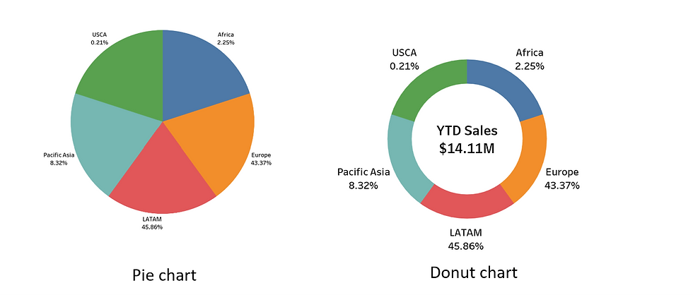
A donut chart is a fancier version of a pie chart. It provides a more creative and interesting way to display numerical data compared to the conventional pie chart. Tableau developers can enhance their visualizations by including metrics within the centre of the chart using the ‘Label’ card function. In this post, I will demonstrate two methods for creating a donut chart. You are free to choose the method that you feel most comfortable applying to your project.
Which chart would you like to use?
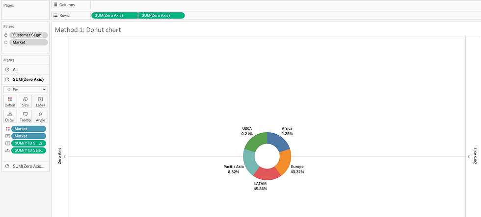
Method 1: Creating a Zero Axis
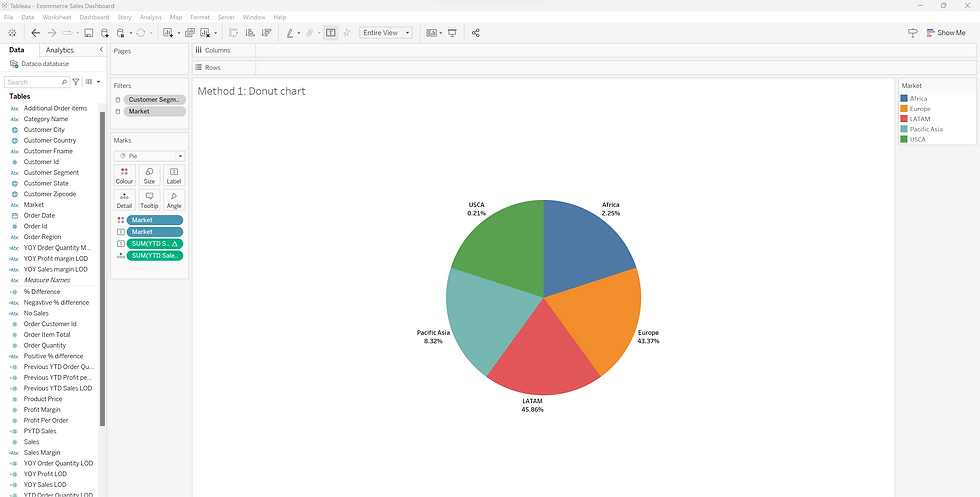
Step 1: Create a Pie Chart
To begin, create a standard pie chart. Tableau require one dimension and one measure from the "Table" shelf to generate the pie chart. In my example, I'm using "Market" as the dimension and "YTD Sales" as the measure for the pie chart. To quickly create the chart, drag the dimension and measure to the “Marks” shelf and click on “Show me.”

Step 2: Create calculated field - Zero Axis
Click on "Analysis" and select "Create Calculated Field."
Create a calculated field named "Zero Axis" with the following formula:

Then the new calculated field 'Zero Axis' will appear on the “Measure Name” shelf.
Step 4: Drag the 'Zero Axis' field to the Rows shelf.
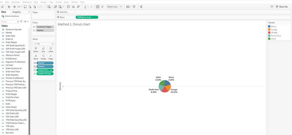
The 'Zero Axis' will now appear on the worksheet.
Step 5: Use Ctrl + right-click and drag the 'Zero Axis' card from the Rows field to the right side of its to duplicate the card.
The same second pie chart will appear.
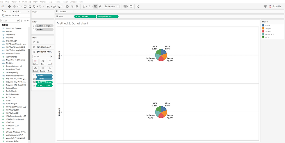
Step 6: Select the third (last) card in the Marks shelf.
This will become the front layer of the donut chart.

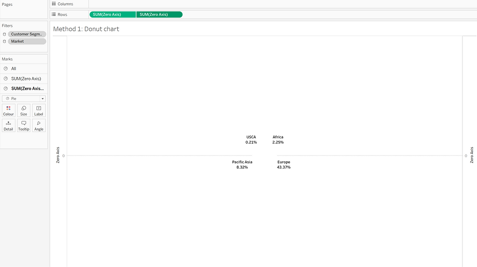
Step 7: Remove all the cards from the third layer in Marks shelf.
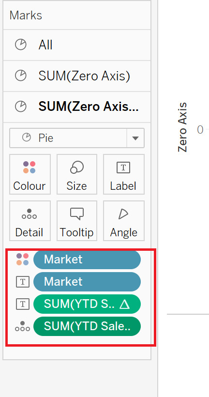
Step 8: Change the color of this layer into white.

After changing the color to white, the second pie chart disappeared from the workspace. However, it hasn't actually disappeared; it has simply been changed to white, making it no longer visible.

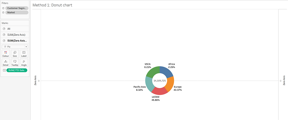
Step 9: Click on "Dual Axis" for the 'Zero Axis' card in the Rows shelf.
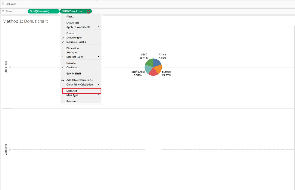
By using the Dual Axis function, two pie charts will be combined together.
Step 10: To view the donut chart, return to the second layer (backward) charts in Marks. Then, navigate to "Size" and increase the chart's size.
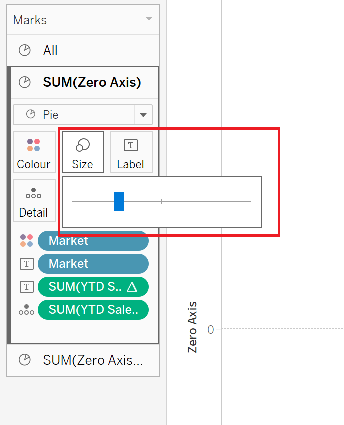
The second chart will increase in size as a result of the changes made in the "Size" card, and the donut chart will be displayed in the worksheet.
Step 11: Add Label for the center of the donut chart (not neccessary)
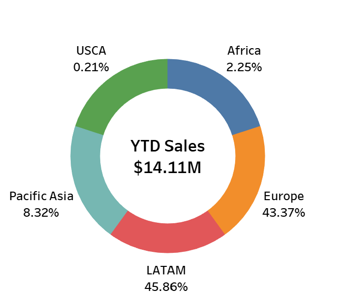
If you wish to display additional metrics, text, numbers, etc., on the empty space within the donut charts, you can do so by dragging the desired measure into the "Label" card of the third layer (charts) in Marks. In this example, I have dragged the measure "YTD Sales" into the Label card.
Step 12: Formatting
Starting from this step, you have the flexibility to format the chart, adjust the font, choose the number format, and customize the chart's size according to your preferences.

After completing these steps, your donut chart is ready to be showcased. It involves a few more steps compared to a pie chart, but the result looks truly professional and neat, doesn't it?
If you want to try the second method, please click on Part 2 of this article.
Comments